A Behind-the-Scenes Look at the Growth of No Sidebar
An inside look at the why and what of the NoSidebar.com rebrand.
When you experience growth of any kind, it’s natural to make an assessment of the changes that might become necessary in order to scale properly.
Such was the case with No Sidebar, and I thought it would be fun to share the experiences I had while putting it through a transformation.
In this 13-minute episode I discuss:
- A look back on the first 4 months of the newsletter
- Why I decided it was time for a redesign
- A window into the rebranding process
- The new content strategy for the website
The Show Notes
- No Sidebar Branding #1
- No Sidebar Branding #2
- No Sidebar Branding #3
- No Sidebar Branding #4
- No Sidebar Branding #5
- NoSidebar.com
A Behind-the-Scenes Look at the Growth of No Sidebar
Voiceover: This is Rainmaker.FM, the digital marketing podcast network. It’s built on the Rainmaker Platform, which empowers you to build your own digital marketing and sales platform. Start your free 14-day trial at RainmakerPlatform.com.
Brian Gardner: Hey everyone, welcome to the No Sidebar podcast. I’m your host, Brian Gardner, and I’m here to discuss the struggles around being (and becoming) a creative entrepreneur.
Together, we’ll identify what’s standing in the way of you building and growing your online business.
No Sidebar is brought to you by the Rainmaker Platform, the complete website solution for writers, designers, podcasters and other online entrepreneurs. Find out more and take a free 14-day test drive at rainmaker.fm/platform.
Ok, so the last couple weeks have been pretty epic — I’ve had the pleasure of interviewing Paul Jarvis and Chris Brogan — two guys that I look up to for many reasons and they shared some really great stuff.
However, today I want to slow things down a bit and talk about something that you may or may not have noticed. If you head on over to NoSidebar.com, you’ll see what I’m talking about.
Go on, take a look at the fresh new coat of paint — and in the meantime, here’s something you should know.
So let’s talk about the elephant in the room, shall we?
Yes, No Sidebar (the website) has a redesign, and that didn’t happen because I was bored one night or want to send money to my friends over at Focus Lab. Though I did hire them for the job.
Anyway, the reason I decided to put No Sidebar through a branding process was simple. It was time for it to grow. It was time for phase two to take place. In other words, the site (and the movement as a whole, actually) was evolving outside what I felt was a comfortable home.
Now before I go any further, I want to preface what I’m going to share with the confession that at times, I have mixed feelings about companies being transparent with their numbers.
Granted, in this case, I’m not a company sharing revenue numbers, but I wanted to talk candidly about the growth of No Sidebar, so that you can understand the reasoning for the decisions I’ve made.
The disclosure of numbers, in my opinion, will help warrant the changes that were made and put them into context.
Ok, moving along.
A Look Back on the First 4 Months of the Newsletter
The premier issue of No Sidebar was published on February 9th of this year — so about 3 1/2 months ago. At the time, I was simply performing an experiment with our Rainmaker Platform, and the content strategy was modeled after Brian Clark’s further.net website.
I liked the idea of curating content. Part of the fun for me is finding it, but I also enjoy sharing that content with those of you who follow me.
So I got the idea of No Sidebar, and figured I’d write a weekly newsletter that dropped links to things that I thought was relevant to my audience — which at the core, were creative types — mainly designers, writers and podcasters.
The initial email list I had was seeded by me emailing the personal list I had built at BrianGardner.com and also from a link that Joshua Becker shared to the No Sidebar opt-in form on his Facebook page.
Issue #1 was sent out to 4,234 people and the subject of that newsletter was the Fear of Missing Out.
The first few issues of the newsletter went over well, I thought, so and it was fun to see things begin to take off.
The basic structure of each one has held true to form so far — it starts out with about 500-700 words of story form that’s relevant to each week’s topic. Then we provide 3 links in a list called “Further Reading” and then a couple of paragraphs with more relevant links in 3 categories called “At Work”, “At Home” and “In the Soul.”
I came up with those, because in my eyes — it covered all bases of the audience I thought I was forming. The idea was to appeal to folks on a business level, on a family level and on a personal level.
So week by week the newsletter went out, and the email list grew at an average of 170 people a week. Currently it’s at 6,744 and there’s been a few weeks with smaller increases and others with much larger ones.
Every time a newsletter gets sent out, we lose about 10-30 folks as well — it’s painful to see, but that’s just the cost of doing business.
The email list and traffic on the site has seen a steady growth — nothing has gone viral, and only one of the issues really got a lot of exposure. The one I wrote about Minimalism currently has over 4,000 likes as a result (go figure) of another instance of Joshua Becker sharing on his Becoming Minimalist Facebook Page.
Right now the growth is feeling very organic, and I like that — kind of feels like the foundation is being built on rock rather than sand.
As far as I know the podcast is also doing well — I haven’t seen the latest statistics on downloads and what not — but since they haven’t told me it’s hitting the cutting room floor, these assumptions I make.
Anyway, after a couple months of what I felt was a successful attempt at building a website and cultivating a community, I decided it was time to take it to the next level.
Why I Decided It Was Time for a Redesign
While weekly newsletters are great, I felt there was so much more that I wanted to write about and share with everyone, and that was being held back by the system that was in place.
So I challenged myself a bit and asked, “Is there any reason why you can’t publish more often?” It didn’t take much thought, and I came to the quick conclusion that there really wasn’t.
I spent the better part of an hour or two at that point analyzing the current design of No Sidebar and decided that a few things needed to change — well more than a few things, but I knew it was time to take the next step, which ultimately meant a new look.
Ok, here’s the part where I let you inside my head a bit — for better or for worse. Don’t judge, these are just the real things I thought.
I felt as though the design that No Sidebar launched with was great — very minimal, but there was a part of me that felt it had too much of a “boutique” appearance — very quaint, bookish sort of feel.
I really loved the typeface I was using — which by the way was Garamond Premier Pro Display from Typekit — but also felt that in some way, that design and appearance was holding things back.
It was weird. I almost felt that it was overly designed — almost designed too well and I wanted to make it feel more relevant.
The bottom line? I felt that I had a huge responsibility to get things right, so I reached out to my friends over at Focus Lab and push this through an official branding process.
A Window Into the Rebranding Process
I won’t go into all of the details of that process, but I thought you might enjoy bits and pieces of it. The following stuff I share came from the preliminary conversations and design brief that was developed.
Logotype — Creatively present the logotype in a way that de-emphasizes the strong and negative “no”. Capture an impactful and approachable visual that will reach the modified target audience and stay true to the authenticity and story behind No Sidebar.
Current Audience — Simple-living focused and minimalists. I wanted to open things up a bit more and appeal to folks outside of that specific niche. So… Target Audience: Creative entrepreneurs: designers, writers, podcasters.
Brand Values — speaking truth, authenticity, success, simplicity, valuable information, knowledge transfer
Brand Vibe — uncluttered, simple, mainstream, professional, entrepreneurial spirit, sassy, smart, modern, (this, by the way was a word I must have used umpteen times along the way)
For those of you who haven’t gone through a branding process, it’s quite tedious and often overwhelming. Idea boards are crazy to look at, because sometimes you’re given a 100 sketched out ideas and you have to weed through and pick things you like.
I’ll link to a few of the shots that Bill Kenney put up on Instagram that tells the story of the No Sidebar branding process.
After a few weeks of idea dumps and what not — we finally landed on the concepts that are currently the new look for the brand. It took a while, because I’m a very particular person and had a specific vision.
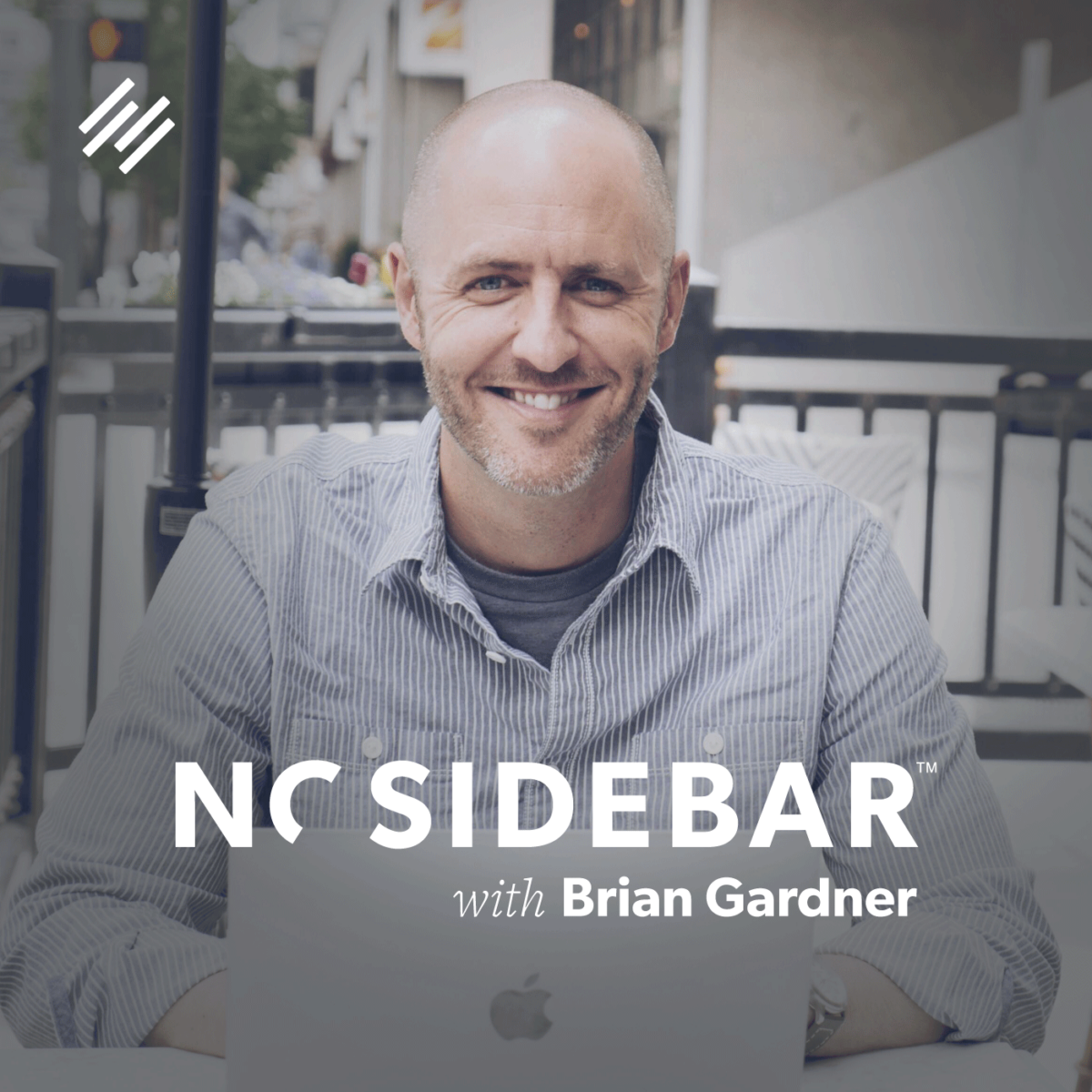
About the same time as the design for the opt-in page was being designed, I went to Denver for our Authority Rainmaker event. I knew that my friends from SPYR were going be there — they are amazing photographers so I reached out to see if they’d be up for walking the streets of downtown in the hope I could get a few shots for the site.
Mission accomplished and the image that you see on the homepage of No Sidebar came from the afternoon we strolled about.
The New Content Strategy for the Website
It took about a month for us to work through the rebranding and site design, but I knew there was another element to all of this that I had to account for — the content.
Even more than the redesign, this was the primary piece — the focal point, if you will, of the growth strategy.
The gist of it was this — in order to grow faster and build a bigger audience, I need to produce content more than once a week.
I figured, the more content that folks could consume, share, or get indexed by Google, the better chance at increasing numbers.
So I reached out to a couple of close friends to ask about writers — I was looking for recommendations on who they thought might be a great fit for the No Sidebar website.
Low and behold, things worked out. I was encouraged to contact Hilary Barnett of Savv.ee and after talking to her and sharing my vision, we totally hit it off.
She’s the founder of a creative agency, a wife, a mom and many things in between — so her perceptive is not only fresh, but extremely relevant. You’ll begin to see some very well-written content from her come out on the No Sidebar blog.
In fact just yesterday we published her first piece.
As the blog continues to grow and we add content on a more frequent basis, I’ll be looking to add more writers. If you have any interest ping me on Twitter @bgardner and we can talk.
The really great thing about having a blog and a podcast, is that they really serve as integral pieces of a symbiotic relationship. The idea is for the blog to push folks towards the podcast and vice versa.
With that said, yesterday we updated the artwork for the No Sidebar podcast cover to match the new logo and identity on the website.
These are good times for me, as I get to utilize the tools that we’ve made available in our Rainmaker Platform for the greater good.
There’s probably some parts and pieces to the rebranding story that I’ve left out — some on purpose, but primarily more on accident.
Nonetheless, I thought it’d be fun to take a week, slow things down a bit and talk about some relevant stuff that’s happening in my online world, which ultimately transfers into your online world.
If you like what you’re hearing on the podcast, the best way to support the show is to leave a rating and/or comment over on iTunes.
Want more? Check out NoSidebar.com and sign up for our newsletter.
Each week we curate the very best and most interesting articles when it comes to designing a simple life — at work, at home and in the soul.
Until next week, this has been Brian Gardner. Thanks for listening.